Portfolio in Motion gives insights of my personal approach of interior architecture.
In this sequence I would like to invite you to have a delicious look on my very first realized project Pasta Baby.
A special thanks goes to the office Bottega+Ehrhardt Architects, which gave me the opportunity and trust to play as a young designer the leading part of the creation of this space… from the very fist sketch to completion.
PastaBaby
by B+E Architekten
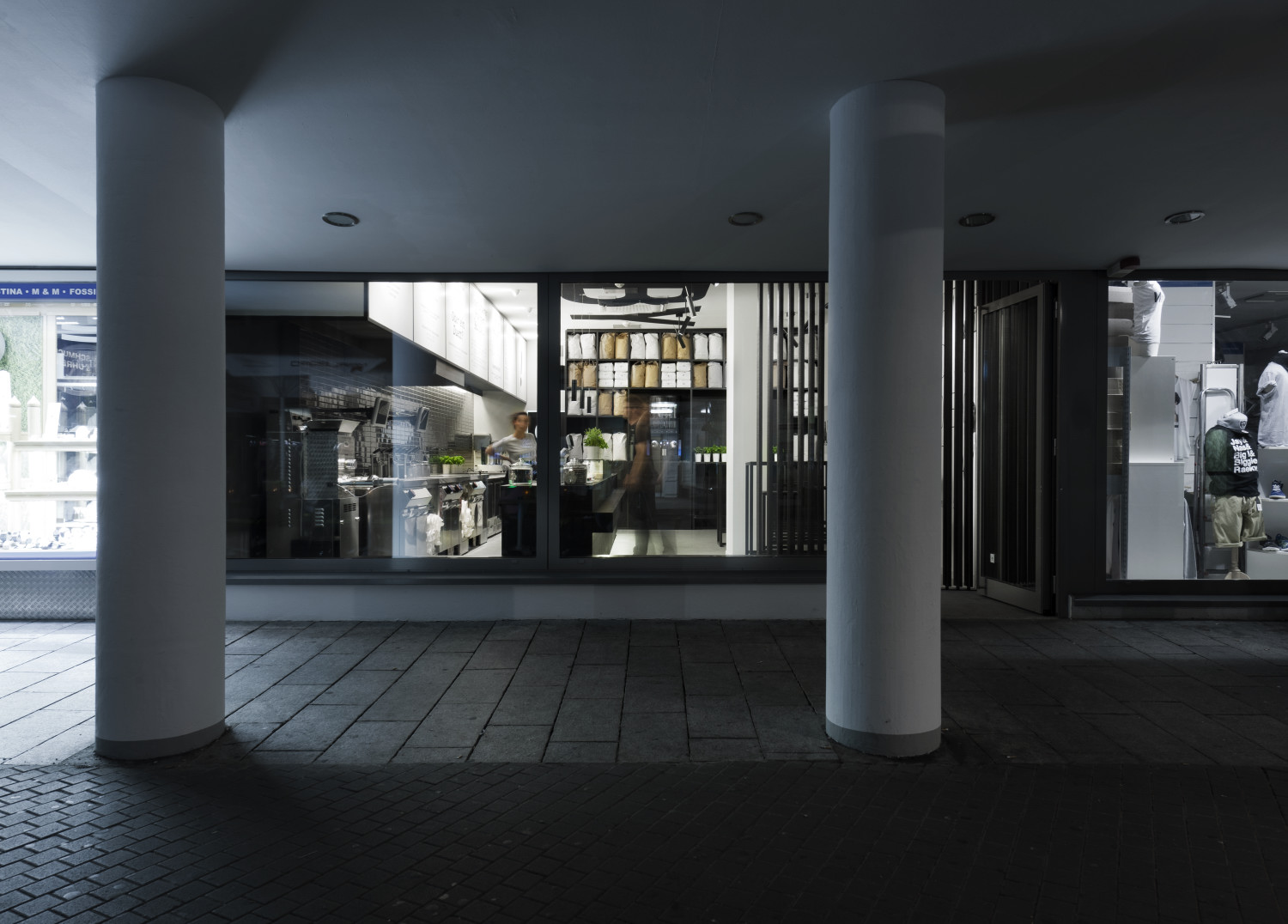
Location. Marienstrasse. Stuttgart
Area. 85m2
Office. B+E Architekten
Service phases. 1-8
Personal scope. Preliminary design, construction documents,
project management, construction supervision
Planning horizon. 02 – 05.2012
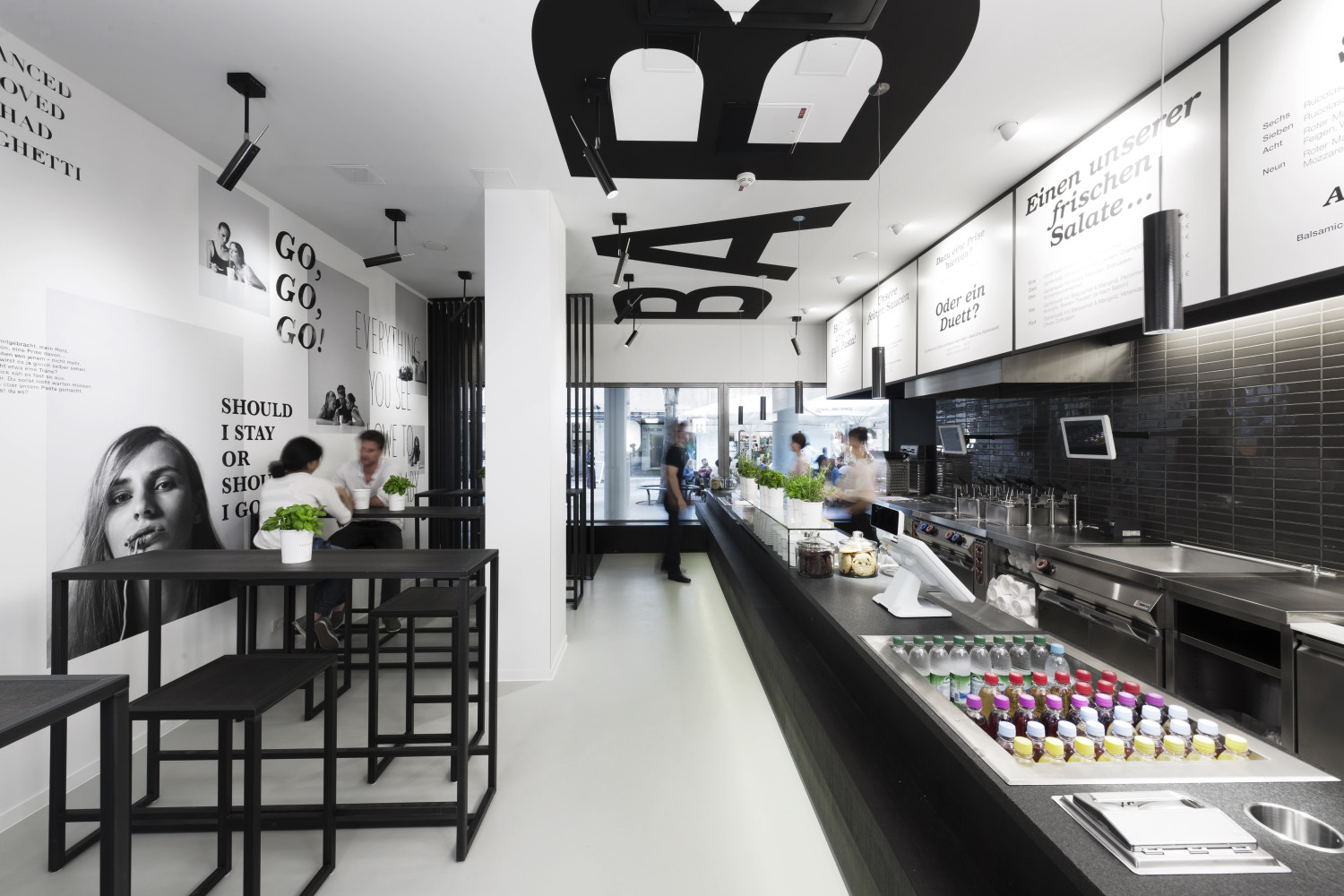
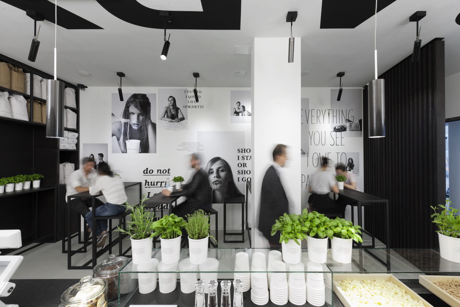
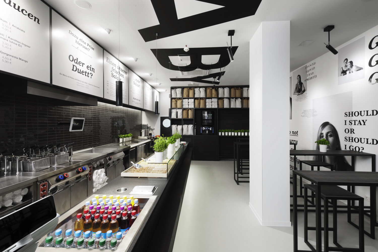
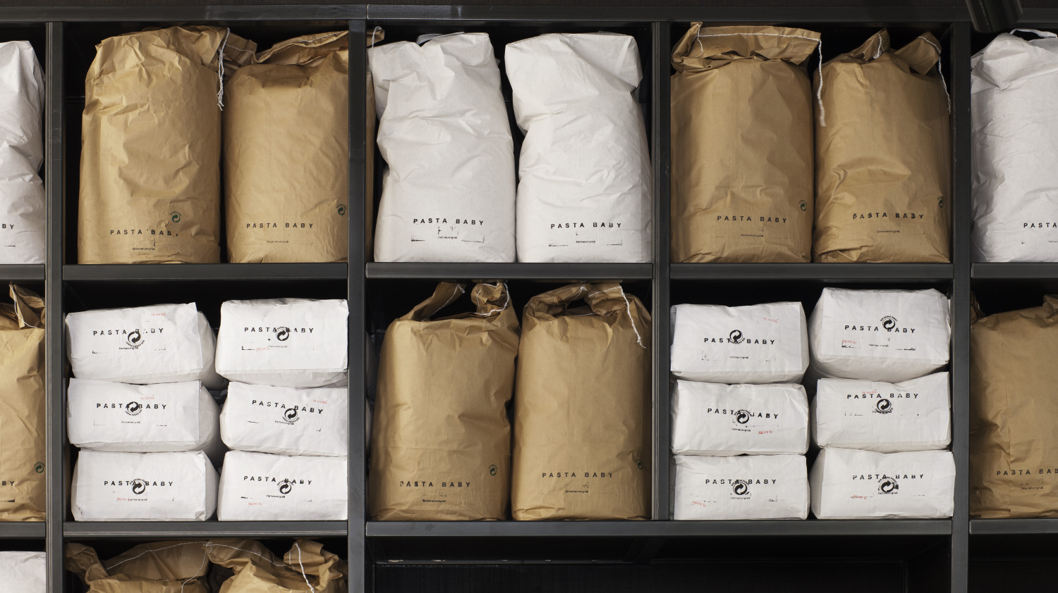
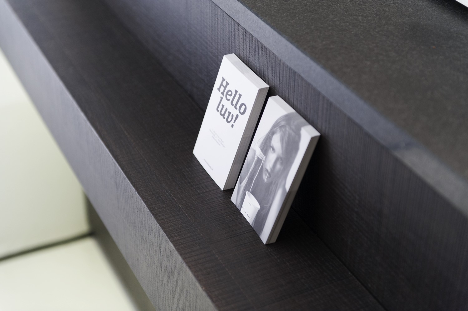
The Restaurant Pastababy is a place where people can enjoy hand made pasta or freshly prepared salads out of the box or inside the shop. In cooperation with the graphic design studio Design Studio Projekttriangle, B+E Architects was charged to generate a corporate identity for the new brand and shop architecture. In order to achieve a flexible interior concept, the task was to design modular furniture elements with a significant identity by form and material. Except of the room-high storage rack, which highlights the flour sacks and likewise the 7-meter-long counter are fixed elements of the shop. More importantly, the remaining furnitures are movable for highly frequented days or in case of events. Additionally, black powdered rough steel, dark stained oak veneer and stone-grey wall tiles create a tasty and elegant frame of the mediterranean food products. Above all, oversized letters, speech bubbles and portraits of the young and urban target group of the brand communicate with the customer underlining at the same time the spirit of the place.
